Although most of us choose to waste time online, having our time wasted for us is incredibly frustrating. How many times have you left a website because it was taking too long to do what you wanted?
Long loading times are one of the most common time wasters for web users. According to Kissmetrics, a delay as short as 1 second can result in a 7% reduction in conversions.
But waiting for pages to load isn’t the only time-waster that web users have to worry about. Here are 5 UX mistakes that could be wasting your customers’ time and sending them into the arms of your competitors…
1. Complicated Registration/Checkout Process
Before you even start thinking about designing your registration process, consider if you really need it. In a survey conducted by Econsultancy, 25.65% of consumers reported ‘needing to register before purchase’ as their main reason for abandoning their shopping carts.
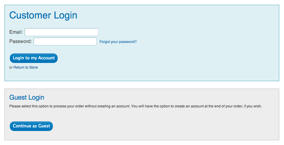
Consider offering users a “guest checkout” option like Attic Tea. You can always give buyers the chance to create an account at the end if they like.
If you do require users to register, try to make the process as short as possible. Do you really need to collect your users’ home and mobile phone numbers? Are 3 security questions really necessary?
In a study conducted by WorldPay, 21% of people reported abandoning their shopping cart because the process was taking too long and 18% because of excessive payment security checks.
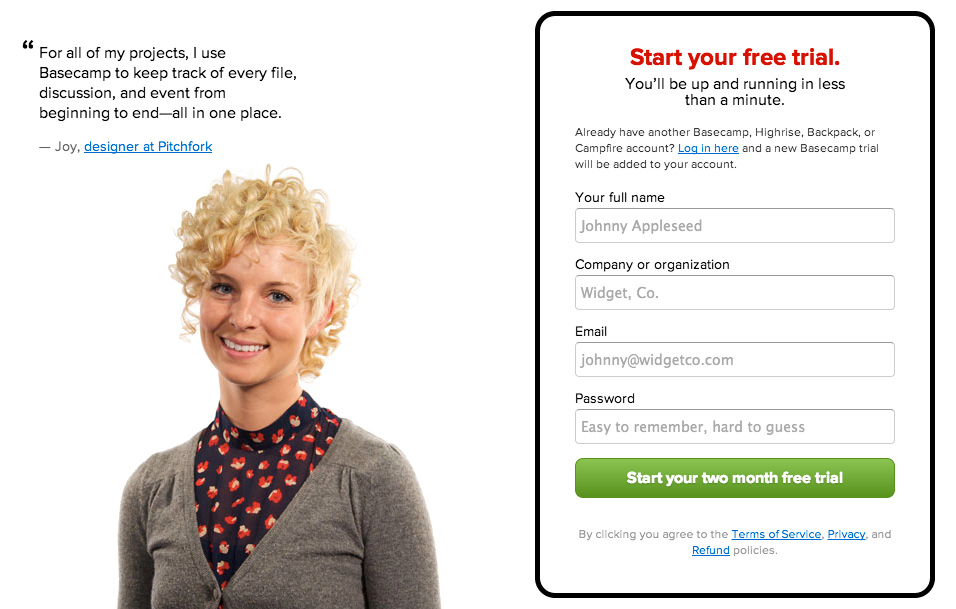
Keep your registration process as simple as possible, taking as little information as you can. Basecamp’s sign up page is a great example…
2. Difficult Navigation
Navigation is one of the most important elements to consider when designing your website. After all, if your users can’t find what they’re looking for, why should they stay on your site?
We’ve all seen websites with OTT navigation menus, but exactly how many options is too many?
According to Kissmetrics“:
“even eight may be too many. This is because short term memory holds only seven items…eight is a LOT more than seven.”
Take a look at this great simple and concise navigation menu from the Bristol Cider Shop.

Make sure your navigation menus are in standard positions (such as down the left hand side or across the top of your page) and only use dropdowns if you really, really have to (and even then make sure it’s crystal clear that dropdowns are available).
3. No Search Box
For content rich websites, a search box is vital. No matter how clear and easy your site’s navigation is, users who know exactly what they want will often prefer to search.
You also need to consider where you put your search box. Hiding it in navigation menus or at the bottom of the page isn’t going to help your customers find anything.
Marketing analytics company Moz have heaps of content. Their search box is placed in the top right corner where users would expect to find it.

Having your search box in the top right or top left of the page is ideal when you consider the common F-shaped scanning pattern. Take a look at this great article on designing the perfect search box from Smashing Magazine for more advice.
4. Unscannable Content
You’ve spent hours, days, months on your content. Your copy is informative, bulging with personality and illustrated beautifully with plenty of images. Great content is vital but you should never assume that visitors are actually going to read it.
That’s because most people (sadly) aren’t going to read your content, they’re going to scan it. And if your content isn’t scannable, you’re going to lose a lot of customers.
Take a look at how copy is laid out on the content marketing blog, Copyblogger.
The best content is concise and well styled with regular sub-headings and paragraph breaks. That way users can scan your content to get the gist and read the whole lot if they want the details.
5. Trying to draw attention to everything
If you haven’t properly defined the objectives for your website, you may end up asking users to do too many things at once. Trying to draw attention to every button, link, image and piece of copy is going to make it difficult for users to find what they want.
“The problem is, if everything on the page stands out, nothing stands out.” Diesel Laws, App.io.
See how Shopify’s simple, clear homepage draws attention to their call to action “Create your store now”.
Using plenty of whitespace, minimal copy and high quality, useful images will make your website easier for users to digest so they can quickly and easily find what they want.
What UX obstacles do you face that waste your time online? Share your experiences in the comments.