I don’t need to tell you about the rise in popularity of mobile devices. Chances are, you’re using mobile devices a lot more than you were 5 years ago and you already know that your customers are too.
Whether you’re thinking of creating a mobile site, a responsive site or an app for your business, you need to bear in mind how mobile users are actually using their devices and how their requirements differ from desktop users’.
Here are 5 of the biggest mistakes I see in mobile web design, as well as some useful tips to help you avoid them…
1. Forgetting how big fingers are
While it’s tempting to cram as much content as you can onto the screen, remember that users need to be able to tap buttons with their thumb or finger.
Making targets too small means users have to work harder to hit them (by focussing on the button with a fingertip instead of a finger pad for example) and the last thing you want is to make it difficult for users to comply to your Calls to Action! Small targets also result in more errors as users accidentally hit the wrong target. It goes without saying that this is incredibly frustrating.
According to this study by the MIT Touch Lab, the average width of a human index finger is 1.6-2 cm which translates to around 45-57 pixels. The average thumb width is 2.5 cm or 72 pixels.
Limited screen real estate makes it difficult to design user-friendly targets for mobile. While you may not always be able to design your targets to suit the average user’s thumb or finger size, it’s definitely something you should take into account when designing for mobile. Take a look at this article by Anthony T of UX Movement for Smashing Magazine for a more detailed look at ideal target sizes for mobile design.
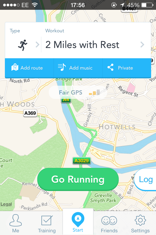
See how the RunKeeper app offer 3 options “Add route”, “Add music” and “Private”. While the three buttons are certainly small, they’re wide enough to press with your thumb without error.
2. Over-complicated tutorials
If you’re anything like me, there’s a good chance you skip app tutorials all together. Unless they’re for games, or other considerably complex apps, I assume that I’ll be able to figure out the mechanics on my own after playing around for a while.
While a bit of instruction may be needed to show users the basic mechanics of your app, over-complicated, long tutorials can be frustrating.
If you need such a long and complicated tutorial, perhaps you should be reconsidering your app’s mechanics in the first place. TechCrunch writer Sarah Perez questions whether the need for a walkthrough is really an indication that your app is poorly designed…
“The problem, in a nutshell, is that in too many cases with new apps, the existence of the walkthrough speaks to core issues with the design. It can come across as lazy. Anything more than a couple of basic pointers sends a message to users that this app is complex, it’s complicated, and now I need to hold your hand while you learn to use it.”
3. Missing out visual cues for desired actions
While you don’t want to have to hold your users’ hands and spell out exactly how your app works in a long and complicated tutorial, you also can’t expect that everyone will use your app the same way you do.
While most users are aware of standard mobile gestures like swiping and pinching, you can’t always expect them know which action they’re supposed to do without a little direction.
However, complex instructions are not always needed. Subtle visual clues can indicate to uses which gesture they’re supposed to make for certain actions. For example, if you want your users to scroll horizontally through product images, why not display half of your secondary image next to your primary one? This way, users will be more likely to swipe to the right as they assume (correctly) that they will be able to view the whole image.
Take a look at this page from Jelly.

Having multiple boxes behind the Answers box indicates to the user that swiping will reveal more answers without directly telling them that’s what they have to do.
4. Limiting functionality
This is a real pet hate of mine. Have you ever looked at a site on your desktop and later continued browsing on mobile, only to discover the mobile version of the site doesn’t include the content or functionality you saw on your desktop?
While a “lite” mobile version of your site can increase load times and be more user-friendly, it is especially frustrating for users who are trying to perform a function they saw on the full site. How often does this happen? According Google’s study “The New Multi-Screen World: Understanding Cross-Platform User Behaviour”, 90% of people move between devices to accomplish a goal and “98% of sequential screeners move between devices in the same day to complete a task.” You can find plenty of advice about designing for multiple screens from Google here…
“Tailor your content, don’t cripple it. Your customers will want to see a tailored experience based on the device that they use – but they still want a complete experience. Make sure to design for mobile, rather than simply removing content from your desktop site.”
5. The dreaded forms
If you’ve ever tried to fill out a form on a mobile device (especially one with a small screen like a phone), you’ll appreciate that, while it’s necessary, it can be incredibly frustrating.
While most of us are likely to accept that we need to fill in forms on mobile in some instances, the majority of us are turned-off by long, over-complicated, poorly labelled or generally badly designed forms.
There are several things you need to bear in mind while designing forms for mobile devices…
1. While long forms that ask for more than the bare essentials are always a bad idea, they’re especially frustrating on mobile where users are forced to type on small touch screen keypads instead of their usual keyboard. Make sure you only ask for details you need to enable the user to perform the function they want to. You can always let them fill in additional details later.
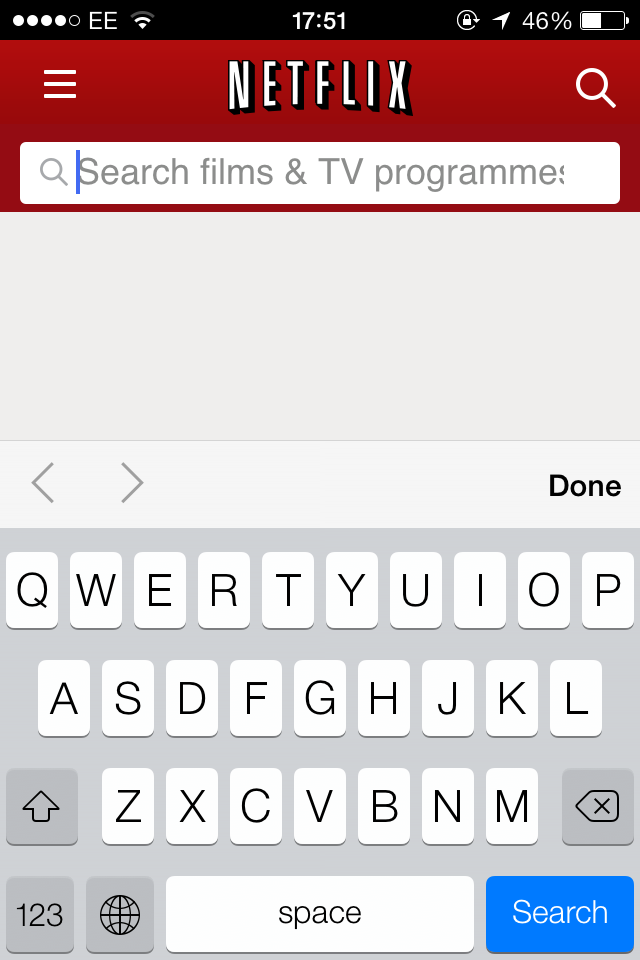
2. Smaller form fields on mobile increase the risk of your user not being able to see everything they’ve entered in that field and check for mistakes. This is especially frustrating when you receive an error and have to sift through the form to try to find it. Try breaking larger fields into several smaller ones and positioning field labels in or above text input boxes instead of next to them. See how Netflix save on screen real estate by labelling fields within the input boxes.
 3. Don’t make your users sign up for anything unless it’s completely necessary. For example, for an ecommerce site, you could allow users to purchase as a guest and give them the option to create an account after their purchase.
4. Remember, mobile users are more likely to have an unreliable internet connection. Multi-page forms can be exceptionally frustrating for users with a slow connection.
5. Remember to make sure your developers use the correct semantic HTML when building forms for mobile. Explaining the meaning of certain form fields means your device or browser can make it easier for users to submit the right information. For example, defining a field as an email address means your device keyboard can display “@” and “.com”. It can also help with verifying fields and displaying error messages. E.g. flagging email fields where user enters doesn’t include an “@” symbol.
Check out these 10 simple tips for improving mobile form UX from econsultancy for a more in-depth look at mobile form design.
What are your biggest pet hates in mobile design?